Magnolia House by Arent&Pyke
‘Moments’ rather than looks best encapsulate a home’s positive impact, and the ultimate moment experienced in Magnolia House is the slow and elegant descent down its new sculptural staircase, the metaphorical spine of both the home and the project.

The two-year renovation began as a basic brief to re-work the kitchen and bathrooms, but our impromptu sketch of an alternative staircase (a gut-felt response to the overbearing timber balustrade in the entrance foyer) sent the project up, as it were, to a whole new level.
Client

The owners chose Arent&Pyke for the colour and texture we favour in our kitchens, but doors soon opened to the rest of the house and by demolition day, the brief had extended beyond recognition. While the volume of the house was retained, its internal distribution was scratched and re-designed for the movements of a young family. Herringbone oak replaced limestone floors and the lighting was resolved to ensure a much warmer welcome.

The staircase turned out to be so technically challenging that the manufacturer vowed never to repeat it, but it was to define the entire project and continues to represent its heart.
“We could not have envisaged the entryway and hallway,” says the owner. “That’s made such a massive difference in the house. This and how they changed the structure and the lines – architectural things they pointed out were ‘very busy’ but that we didn’t notice – and now everything has a smooth flow. It makes everything… calm.”


‘Calm’ at home is the holy grail for a young family, and so we also introduced a new formal ‘adult’ zone within ears’ reach of the children’s bedrooms. Grown-up sophistication is found in a Cassina Rio coffee table and Minotti Seymour sofa in petrol blue. Gubi Beetle chairs sit at a nutwood table in the adjacent formal dining room. “The fact [Arent and Pyke] are both mums really attracted us because they have their own families and they understand the place we’re in and what’s important.”


The home’s various spaces needed to interact, but also to find clearer respective definitions. To this end, what was a slim, low aperture here has been expanded to a full-sized window looking into the lower, informal rooms of the house. The upper panes have been mirrored to add the illusion of additional space.

“They were really good at taking us on a journey and through all the moodboards and sketches. We felt comfortable the outcome would be amazing,” says the owner.

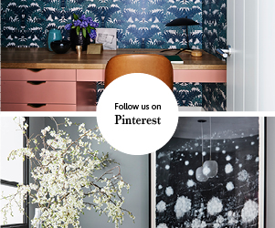
Large rugs and artworks by Tim Summerton and Laura Jones demarcate zones and create a sense of rhythm and tactility. Details soften the existing structure and provide new architectural interest; in the corridor, panels conceal a powder room and a study lined with peacock-hued House of Hackney paper that sets off the salmon pink cabinetry. What was “a bit of a nothing room” is now tantamount to a jewellery box, delighting passers by when the door’s left open (which it very often is).

The wide hallway downstairs leads to new steel doors and a threshold on the lower level that represents the end of the formal zone. “The informal area is equally as beautiful but the furniture is very generous,” says the owner, of the sumptuous oversized B&B Italia and De Padova lounges. With verdant views to the newly landscaped exterior by Secret Gardens, it has become an indoor-outdoor space, the kitchen echoing the Australian garden in eucalypt tones.


With an idyllic environment for cosy family times, large barbecues and many a happy Christmas, this space – and the rest of the home – is destined for the soft-focus childhood memories to come.

Interior design: Arent&Pyke
Photography: Anson Smart

